


Unlocking the Power of Dialog and Modal: Best Practices for Accessibility and Usability
A Deep Dive Into HTML <dialog> Element, Modal UI Design, and the Importance of tabindex

I listened to the Syntax podcast the other day. In this episode, the hosts challenged each other by asking advanced web development questions. Among these interesting questions, one was about the difference between dialog, modal, and div with dialog role. This is a very interesting topic and implementing dialog can be tricky. In today’s post, I would love to walk you through the difference between dialog and modal, what tabindex is, and why you might need tabindex in some conditions.
The HTML dialogelement is used to create modal and non-modal UI elements. The difference between modal and non-modal/dialog is that when you open a modal, your interaction with the rest of the page will be blocked except scrolling the page; while opening a dialog won’t intercept your interaction with the rest of the page. Take a look at this example,
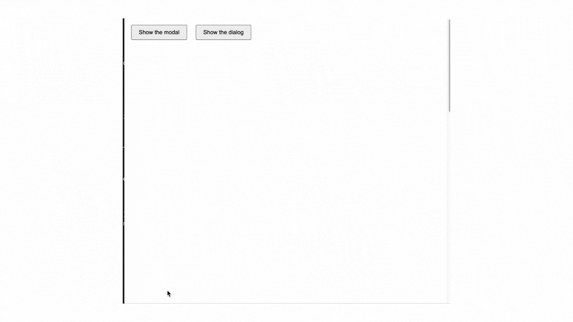
As you can see from the demo, modal will interrupt all the interactions with the page while the non-modal dialog still allow interactions.
const dialog = document.querySelector("dialog");
const showButton = document.querySelector("#show-dialog");
const closeButton = document.querySelector("dialog button");

      showButton.addEventListener("click", () => {
        dialog.showModal();
      });

      closeButton.addEventListener("click", () => {
        dialog.close();
      });
The dialog element has a showModal method and close method. To be noted, the dialog that using showModal and close method to be toggled can be dismissed by pressing the esc key on the keyboard and be accessed by tab key.
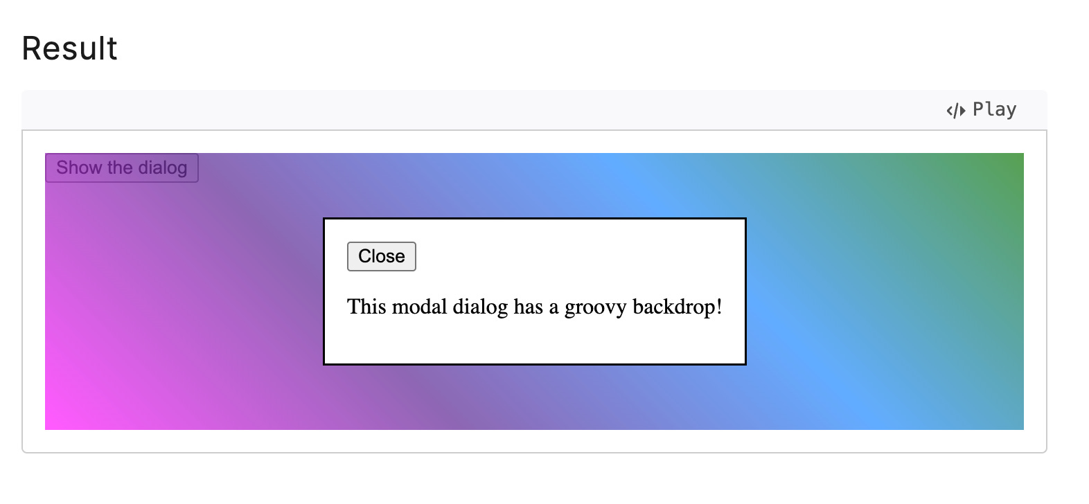
Also, using the native HTML dialog element, it has a CSS ::backdrop pseudo-element can be used to style the backdrop of a modal dialog.
dialog::backdrop {
  background: rgba(0, 0, 0, 0.3);
}
The dialog element also has an elegant usage, when using the HTML <form> elements within the dialog , adding the attribute formmethod="dialog" to the button will save the state and will not submit the data. Take a look at this example from the docs,

formmethod="dialog" attributeIn this demo, the cancel button closes the dialog modal while saving without submitting the data.
Last but not least, if you want a little bit fancier for styling, headlessui package developed by Tailwind team is a great choice. It is fully accessible and it also does everything behind the hood.

There is a warning in the dialog docs, it says,
Do not add the
tabindexproperty to the<dialog>element as it is not interactive and does not receive focus. The dialog's contents, including the close button contained in the dialog, can receive focus and be interactive.
The tabindex global attribute is often misused with the <dialog> element, but it's actually a very useful attribute when applied correctly in certain conditions.
The tabindex allow developers to make the HTML elements focusable and get its name from the tab key from the keyboard.
When you set the tabindex="0", the element will be tabbable due to the tabindex . When you set the tabindex="-1", the element won’t be reachable via the tab key on the keyboard.
However, using tabindex="-1" can be very useful in specific scenarios where you want to make an element focusable programmatically or ensure it doesn't interfere with the natural keyboard navigation flow. Take a look at this demo,
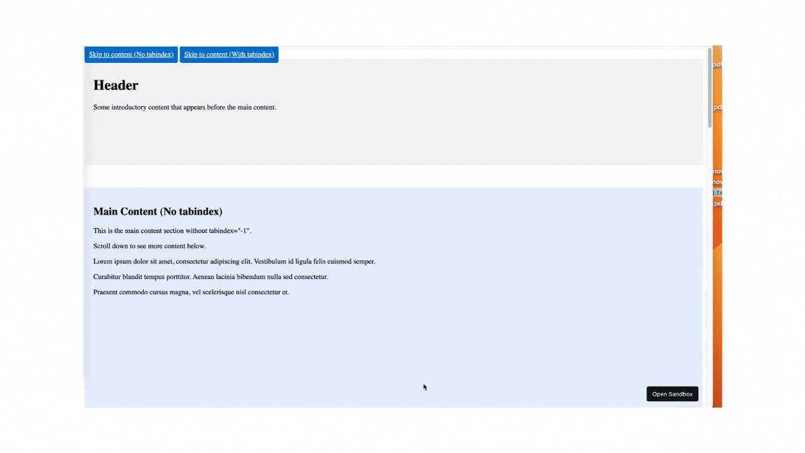
As you can see from this demo, when an element doesn’t need to be part of the natural tab order but must still be focusable using JavaScript, tabindex="-1" is a great choice.
The main content of the tabindex="-1" will be automatically focusable (red border) without being part of the natural tab order.
For the section#main-content-with-tabindex, adding tabindex="-1" allows the browser to:
Scroll to the target element.
Programmatically set focus to it.
document.getElementById('#main-content-with-tabindex').focus();Enable
tabkeyboard navigation within that element.
That’s it. Dialogs and modals are powerful UI tools that, when used correctly, enhance both accessibility and user experience. The native HTML <dialog> element simplifies the implementation of modal and non-modal interfaces, offering built-in methods like showModal() and close() for easy management. It also includes features like the ::backdrop pseudo-element for styling and attributes like formmethod="dialog" controlling form behavior elegantly.
Understanding and using tabindex effectively is equally important for creating accessible and intuitive interfaces. While it's tempting to misuse tabindex elements like <dialog>, adhering to best practices ensures a seamless navigation flow. Whether you're enabling focus programmatically with tabindex="-1" or making elements tabbable with tabindex="0", the attribute is a key tool in your accessibility toolkit.
By combining proper usage of the <dialog> element and thoughtful application of tabindex, you can craft interactive, user-friendly experiences that cater to diverse audiences, enhancing usability across your projects.